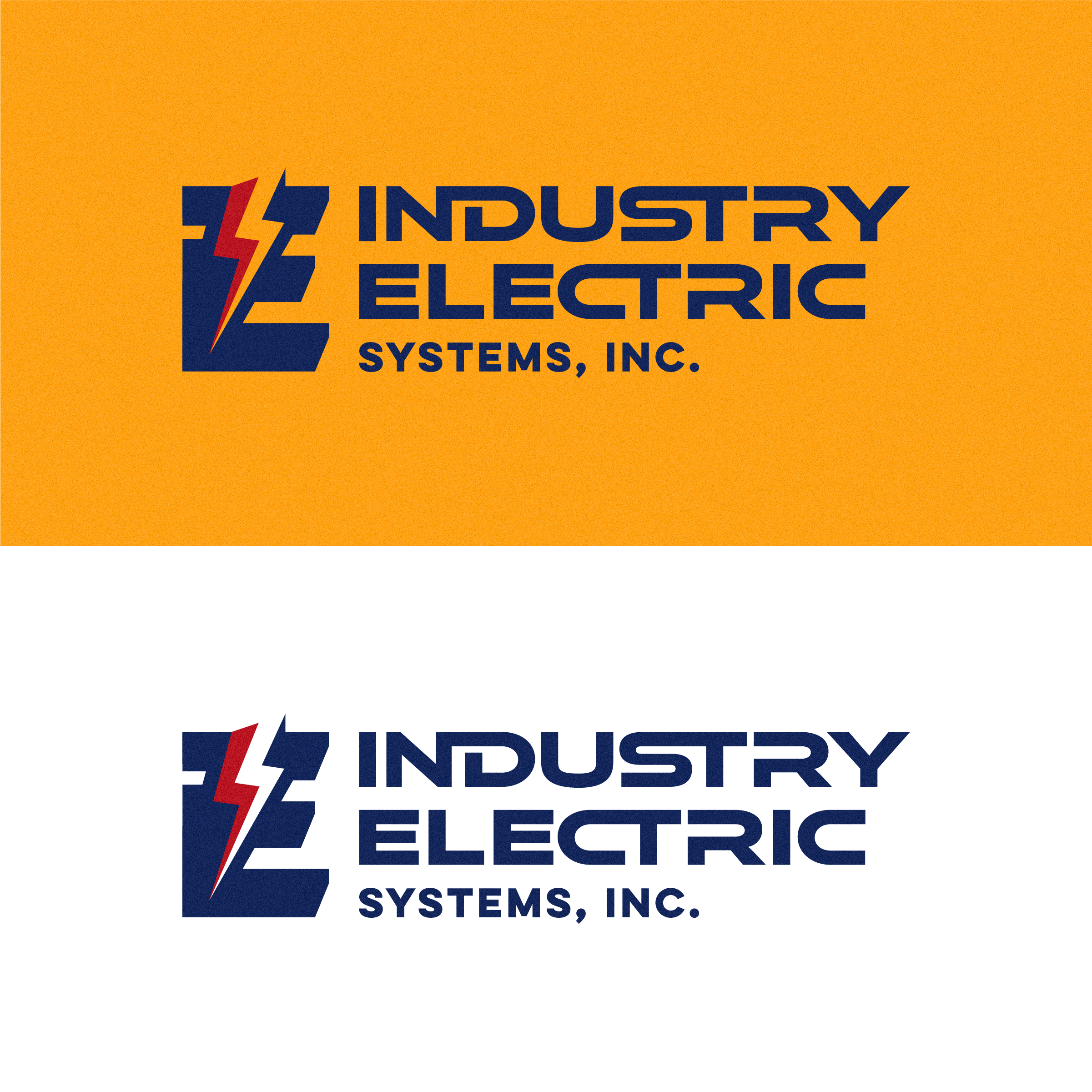
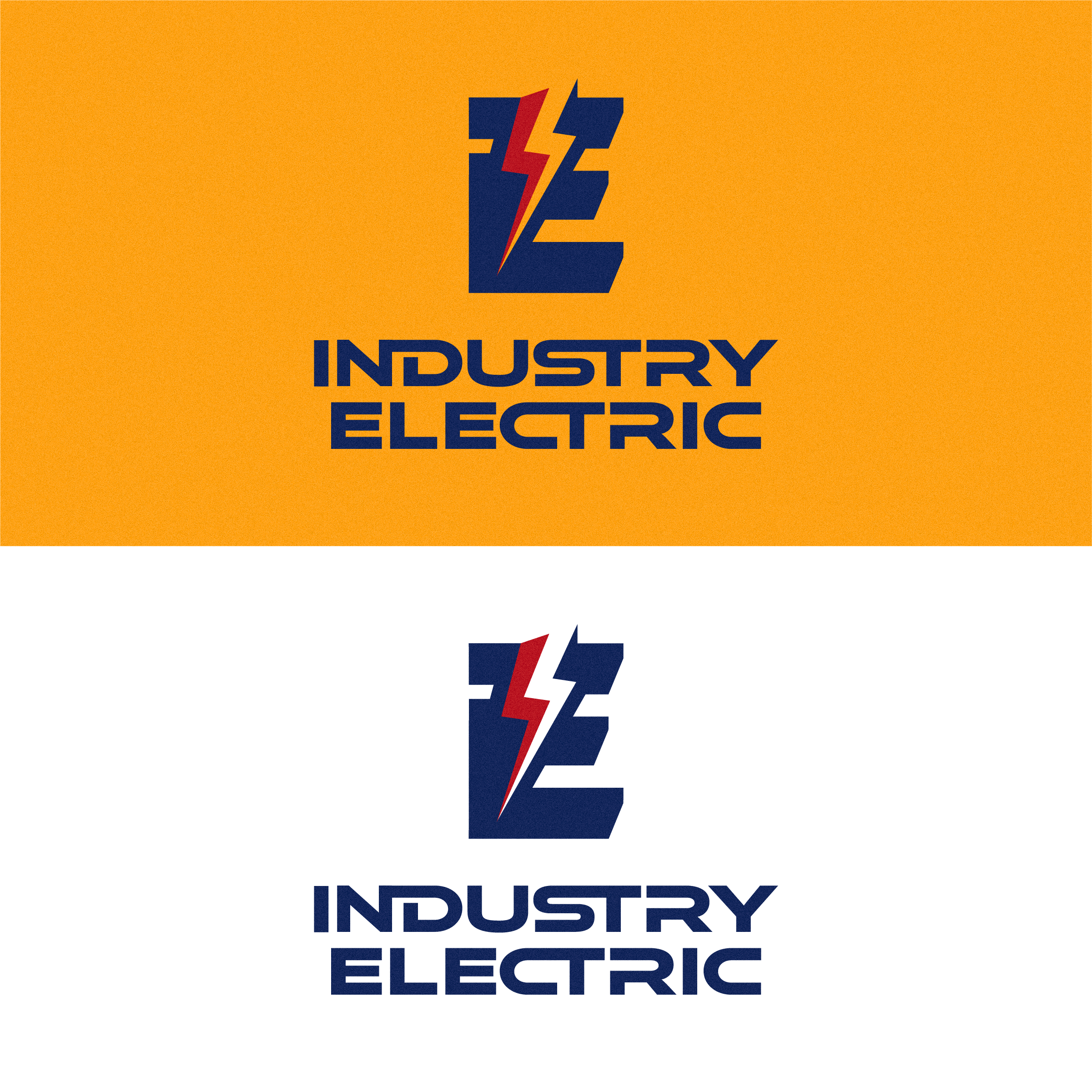
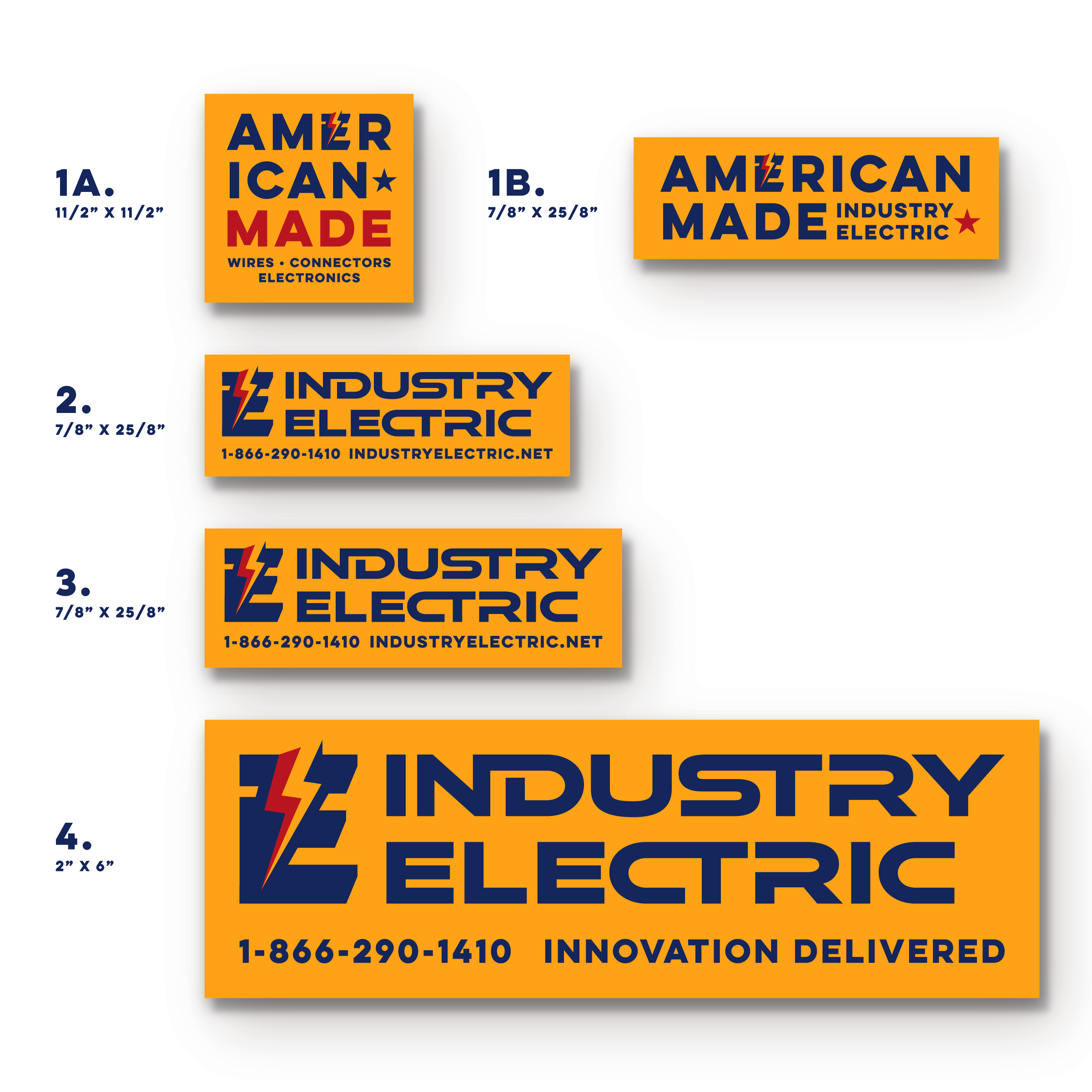
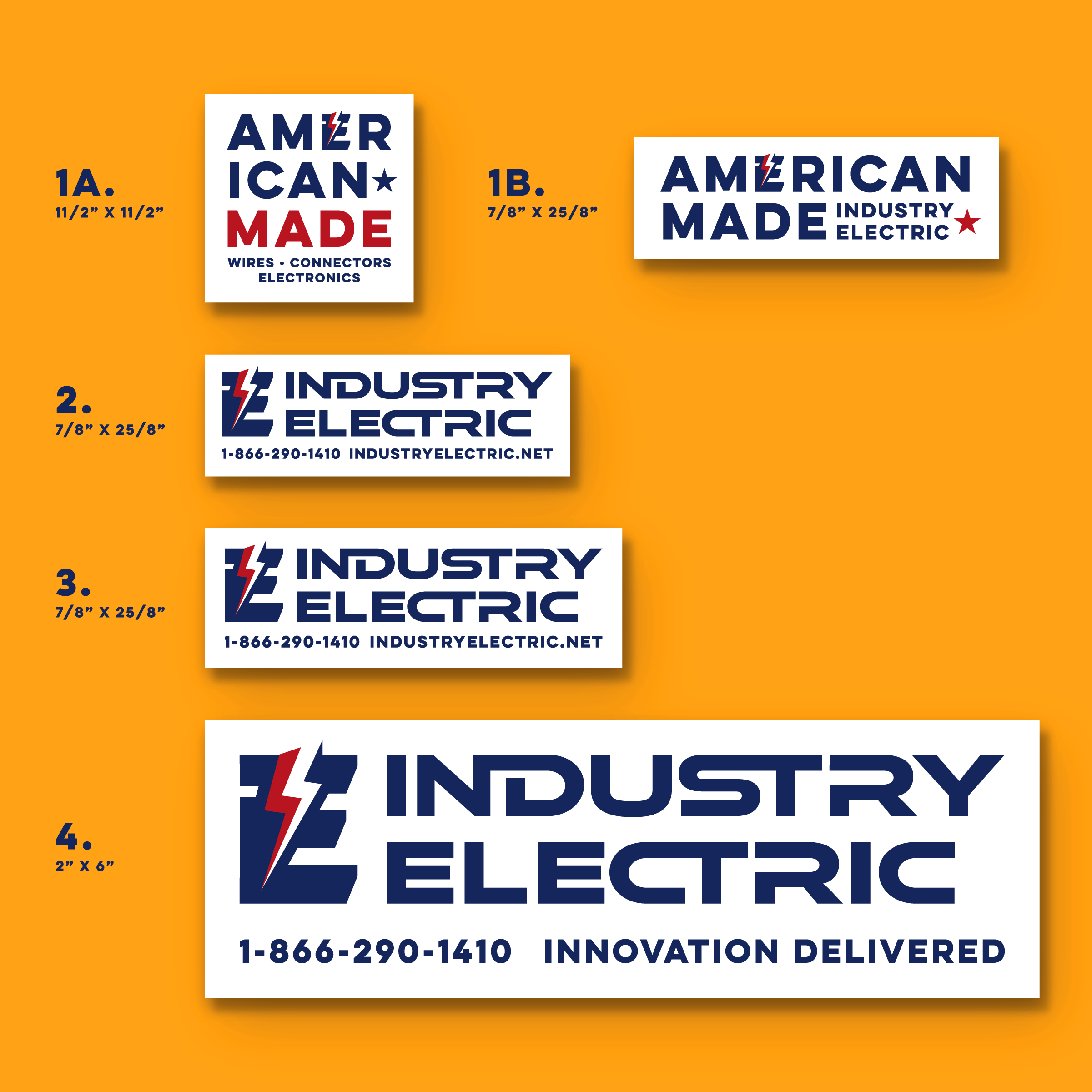
I had the chance to give Industry Electric a full brand refresh—bringing new life to a company with decades of experience behind it. The goal was to create a look that felt sharp, professional, and built to last, while staying true to the gritty, hands-on nature of the work they do every day.
-
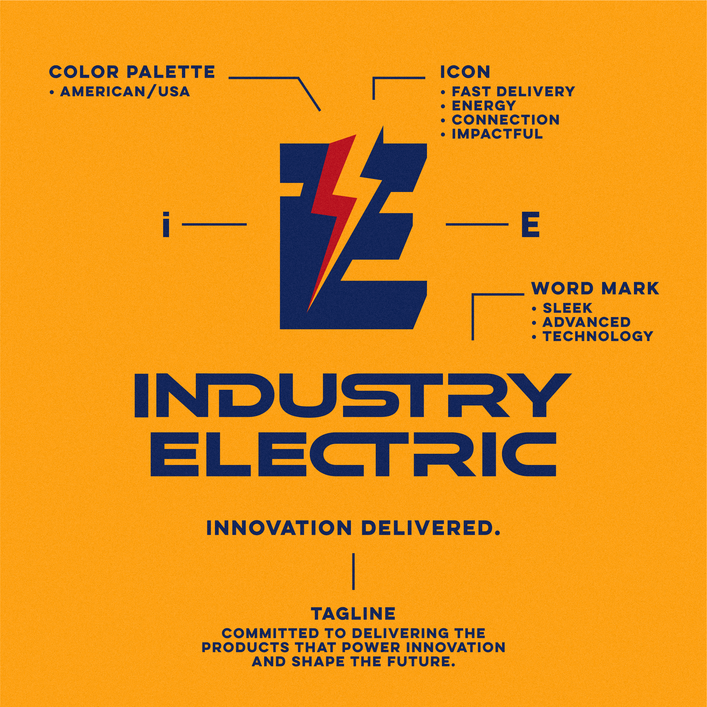
The new logo became the backbone of the brand. The previous mark felt dated and didn’t reflect who they are today. I designed a bold, custom wordmark inspired by old-school tooling, classic machinery, and industrial design—drawing from the kind of logos you'd find stamped on metal equipment that lasts for generations. Clean lines, balanced spacing, and solid visual weight made it versatile across every touchpoint. The result: simple, tough, and memorable.
-
I carried the new brand over to their uniforms—because how you show up matters. The fresh look keeps their team looking sharp on every job site.
-
Next came the vehicle graphics—turning their fleet into rolling billboards that work 24/7. The clean layout, bold logo placement, and sharp details help them stand out on the road and build trust wherever the job takes them.
-
Branded letterhead and business cards were designed to keep things professional and consistent across all communication. From client proposals to quick notes, everything now reflects the same level of quality.
The Scope

